
Link Light Rail
A brand refresh for Link Light Rail which reflects the diversity and vibrancy of the ridership within the greater Puget Sound community as the rail system expands.
Branding | Layout | Advertising | Print Production


Collaborator: Olin Berger
Roles: Visual Designer | Art Director
Tools: Figma | Illustrator | Photoshop | InDesign
Timeframe: 3 months (January – March 2023)
Overview
Project Goal
Create a brand refresh for Link Light Rail which reflects the diversity and vibrancy of the ridership within the greater Puget Sound community as the rail system expands.

Beauty shot of current Link Light Rail design from City of Bellevue (.gov).
Problem to Solve
Link Light Rail will soon complete its expansion into the greater Puget Sound region. Metro Transit and Sound Transit buses are plain and confusing to identify which service is which. The branding is too low to the ground to be seen clearly in and through traffic at rush hour. We aimed to increase Link Light Rail’s street visibility, more accurately reflect the diverse ridership of the greater Seattle area, and showcase Link’s infrastructural sustainability.


Research + Demographic
How is Link Light Rail Different than Other Public Transit?
Link Light Rail is the first major light rail system to run on completely carbon-free electricity. It’s also the first transit project in the Pacific Northwest to receive verification by the Institute for Sustainable Infrastructure (ISI). Link Light Rail stations run off of carbon neutral hydropower (purchased through Seattle City Light), and carbon-free wind energy through Puget Sound Energy’s Green Direct program.


Who Rides the Link Light Rail?
Ridership potentially includes commuters within range of the light rail, riders without personal transportation, commuters from the greater Seattle region, large public event attendees, and locals/visitors going/coming to/from the airport. In general Seattle area locals care about sustainability and protecting the planet, so this is an important feature to showcase as Link Light Rail Expands.


Thinking + Process
Scope
After researching the brand and looking at the population it serves, we noticed the demographic had diversified since Sound Transit’s last rebrand. Since Sound transit is a major public service with many branches, we chose Link Light Rail to contain the scope and focus on a single entity as a proof-of concept.

Brand Tone
The ridership of Link Light Rail is increasingly diverse. Sustainable community transport is more important than ever due to climate change and waning support for car culture. With this in mind, we decided the brand tone should be community-focused, service-oriented, and forward-thinking. We kept these qualities in mind when making design decisions.

Color, Typography, and Photography
We chose bold yet friendly colors and patterns that stand out against our famous “long gray” season. We selected Anisette as our headline typeface because it is modular, dynamic, and bold. We modified Anisette in Illustrator to create our logo, which features a rider moving forward on the word Link. We chose Filson Pro for welcoming, friendly, and helpful information. As our workhorse typeface, Work Sans is an accessible and legible font that feels authoritative enough for a public utility. Our photography needed to show bright, open spaces where Link conveys our community, and candid or head on shots of Link’s riders and staff to show community focus and service orientation.
Pattern and Shape
As the brand developed, we found that the half-moon shape was our unifying theme that could help us maintain visual interest and unity with important content that could sometimes look dense and intimidating to busy riders.

Logo
Olin and I designed the new logo with a forward slant and a lower-case “i” to show the individual rider and the forward-thinking. The all caps at the bottom stabilize the logo. The logo font is based on Anisette, which I customized to form a pleasing rhythm at this angle.


These are my preliminary logo sketches and Olin’s first version of the logo. The first version is sheared to show forward motion, but lacks consistency in stroke width and rhythm.


Deliverables
We ideated in Figma and created a library of low-stakes deliverables to test our re-brand, which helped us maintain cohesion as two designers working separately. I created the print deliverables, and Olin made the website and social deliverables. We met to give each other feedback and refine each deliverable so it was consistent with the brand.


Website

Email Template

Environmental Graphics
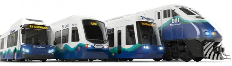
Train Wrap

This vibrant train wrap extends above the height of an SUV so potential riders can see it from the street.

The modular shapes and vibrant colors add excitement to the normal white and gray of Seattle’s landscape.
Station Wayfinding

Modular shapes become wayfinding aids and add color and interest to Seattle’s brutalist architecture.
Ticketing Kiosk
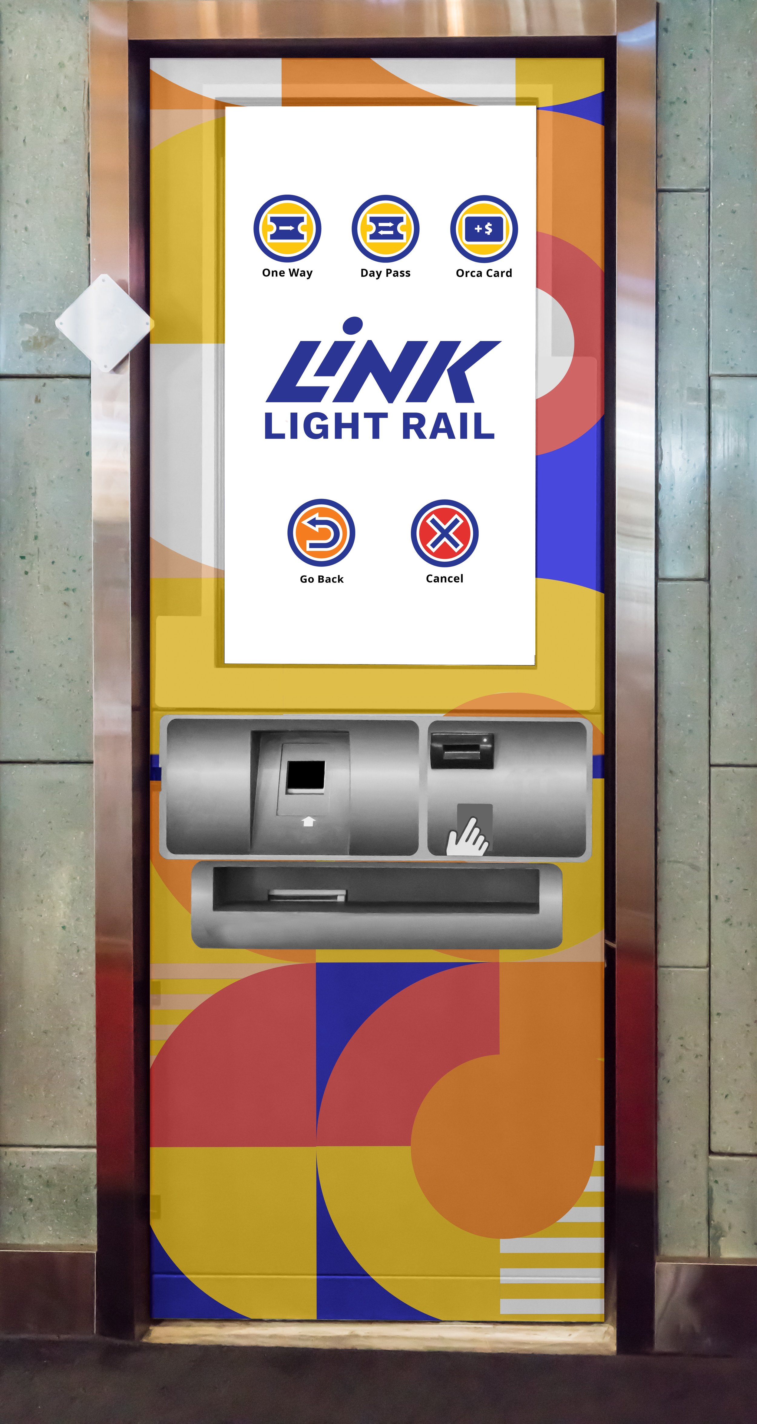
The new ticket kiosk is impossible to miss. Riders know where to buy tickets, and the new icon system I designed is easy to navigate for non-English speaking folks.
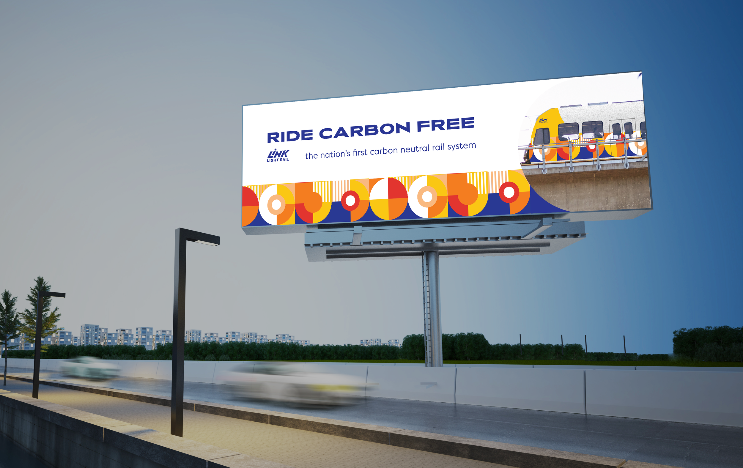
Out of Home Advertising

Brand Guide
Print Production and Design
I designed and produced a new brand standards guide in InDesign that delineates rules and instructions for how to maintain consistency in the future.


Key Takeaways
What I Learned
We got attached to early design elements that no longer worked as the project progressed.
We don’t have to use everything! When we let go of our early ideas, we made room for cohesion and refinement.