The Mark Magazine
A quarterly magazine that connects artists of any level to their communities.
Branding | Layout | Print Production


Roles: Visual Designer | Art Director | Production Designer
Tools: ProCreate | Illustrator | Photoshop | InDesign
Timeframe: 3 months: September – December 2022
What is the Mark?
The Mark is an approachable art magazine that appeals to 16-65 year olds interested in beginning or maintaining a studio art practice. Many well-known art magazines are too esoteric for many people just getting started in art. I imagined an art magazine that feels approachable to anyone who makes art that also provides a way for readers to connect with their local art community.
Who Reads The Mark?
Our potential readers make art at different levels. Some are just getting started, and others are already artists hoping to gain a fresh perspective.

The Dabbler
The dabbler makes art as a hobby, doesn’t have much creative experience, but wants to connect with other artists to learn techniques and make friends.

The Spare Timer
The spare-timer is a recent graduate who works multiple jobs to pay off debt. He maintains a studio practice which they hope will turn into a career.

The Seasoned Pro
The seasoned pro is an accomplished artist, connected in the scene, and wants to connect to others outside of the established art scene.
Take a Peek at The Mark Magazine
Click images to see spreads in detail.


Process
Masthead
I went with a paint swash with the title knocked out for the masthead because the magazine focuses on process. I created a series of paint swashes and recolored them in Photoshop to maintain the physical texture and saturation.
Content Curation & Flatplan
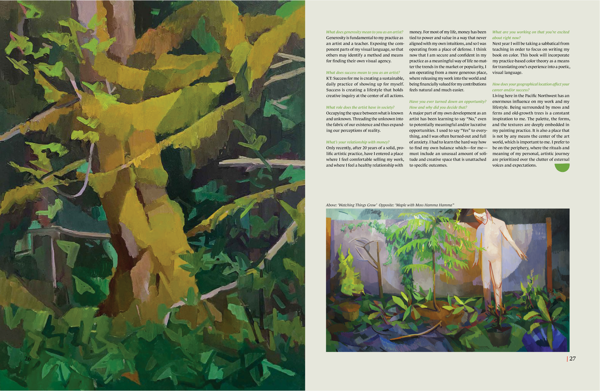
Process is the context that’s missing from many art magazines. I curated articles about studio practices from Seattle arts foundation sites to keep the scope small enough for a proof of concept. Front of Book articles show how to guides, young artist spotlights, and showcase local art nonprofits. Feature Spreads are in-depth interviews with local artists about their practice and local art shows. Back of Book articles offer insight on how to become more involved in the arts community with how-to sections for grants, applications for calls-for-artists, and fellowships.
How Featured Artists Were Chosen
The artists aren’t world famous, yet regularly exhibit their work locally. The ages and backgrounds of featured artists are varied, so any of The Mark’s readers can relate to artist’s stories and see themselves as artists, too. The idea is that The Mark would choose local artists for each regional edition.

Ads
Advertisements were all chosen to reflect the interests of The Mark’s potential readers. Entertainment, food, and art supplies all fuel creativity, and validate creative pursuits. I chose hands-free and art-related content because of its relatability to artist lifestyles.

Typography & Illustration
Design decisions kept friendliness, fun, artistic nature, and down-to-Earth qualities in mind. The masthead is a paint swatch made with a palette knife to reflect the tactile nature of making art. The masthead and headlines use Monarcha because it’s a friendly looking typeface that refers to Carolingian script, used in the craft of illuminated manuscripts. Body copy is set in Le Monde Standard Book for its approachability and legibility. I illustrated a system of friendly and approachable marks in ProCreate to aid in scanning and article navigation.

Key Takeaways
Taking away judgments on value and quality leaves readers free to be inspired & express themselves.
Showing the studio practices of working artists helps newbies who are stuck create a new practice
Providing how-to guides, artist calls, grant and fellowship opportunities, readers can share their marks with the world.