

Unleash Joy!
The BIC 4-Color Pen makes writing and drawing fun again.
Advertising | Layout | Print Production

Roles: Illustrator | Visual Designer
Collaborator: Calista Klein: Lettering Artist | Visual Designer
Tools: BIC 4-Color Pen | Adobe Illustrator | Adobe Photoshop
Timeframe: 1 month (September – October 2022)
Overview
Using the BIC 4 Color Pen takes us back to a time when drawing was fun—it brings out your inner child! Writing and drawing with the BIC 4 Color Pen helps Seattle commuters, techies, and students get a break from screens to unleash joy through color and nostalgia.
Problem to Solve
So many digital tools are available for writing and drawing. How might we show Seattleites that the BIC 4 Color Pen is a useful tool that makes writing and drawing fun again?

Target Audience
Our assigned target demographic was students and early-career professionals in Seattle. These Digital Natives spend time on social media to unwind and connect. They’re also the most depressed age group due to long work hours and high debt.
Our survey showed this demographic sees BIC as a reliable and inexpensive office supply brand. They experienced nostalgia while clicking the ink cartridges, and related happy childhood memories of doodling and learning to write.

Advertising Strategy
We advertised in the metro and transit systems to reach carless commuters who could decompress with a pen and paper instead of scrolling. Ads that show inexpensive, low-stakes entertainment and invoke nostalgia capture their attention.

Concept
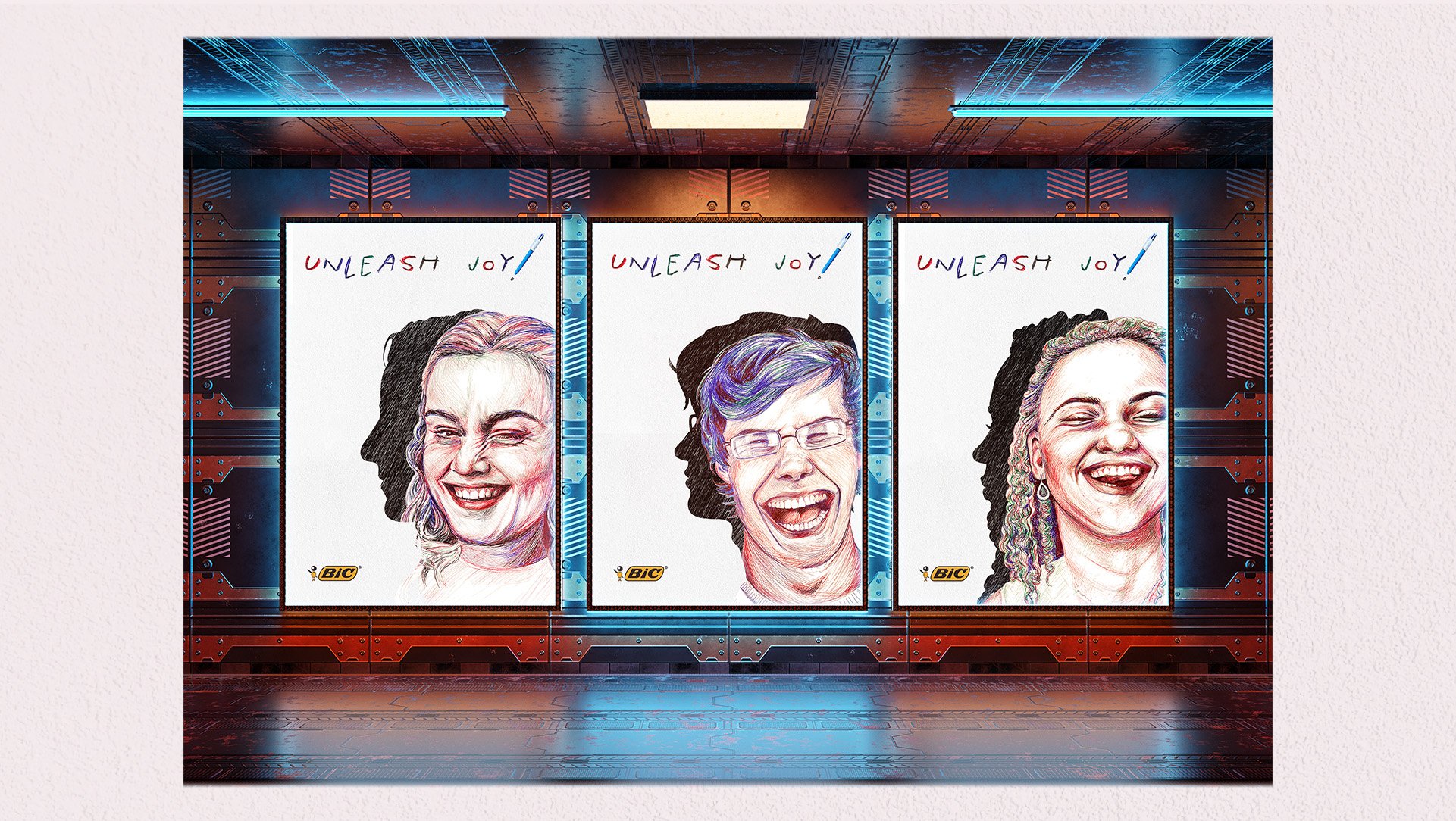
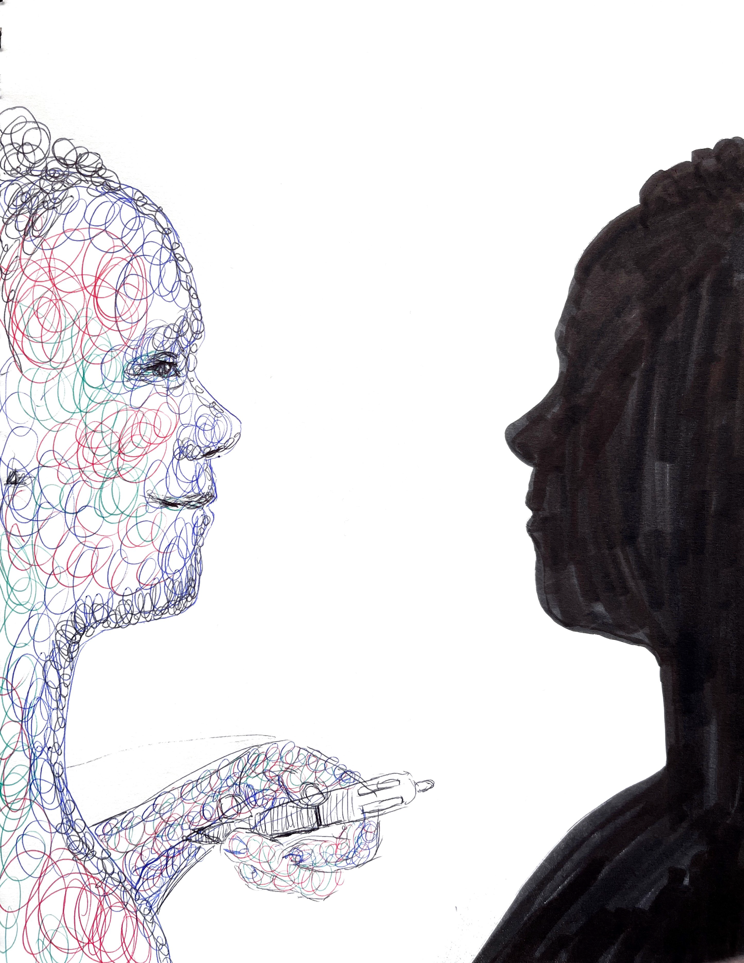
Through forced connections, mind-mapping, and thumbnail sketching, Calista and I brainstormed what brought up the most nostalgia and emotion. We came up with a person emerging from a dark silhouette into color to show the joy of color. We pivoted away from an adult silhouette, showing a happy inner child to an adult in our target audience.


Process
We were inspired by Dutch photographer Maud Fernhout’s series “What Real Women Laugh Like”. As product demonstration, I drew portraits with the BIC 4 Color Pen, and made the silhouettes in Illustrator. Calista hand-lettered the headline with the pen as exclamation mark to show the product and lead the eye toward the BIC logo in the bottom left corner. We achieved our final layout through A/B testing: we each made mockups, got feedback on what worked best, and incorporated it to improve the layout.


Key Takeaways
• Product demonstration of joyful people turn heads.
• Clear hierarchy, and ample whitespace make the message clear.
• Calista and I had fun hand lettering and drawing with the BIC 4-Color Pen!